Title Design Research Man Hunt
1. How many titles are displayed during the opening sequences to the film? Which ones?
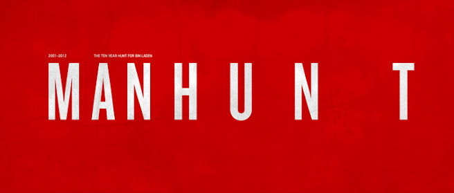
- There were a total of nine titles displayed during the opening sequence to the film MAN HUNT. This included the producers, staff and crew in a vague acknowledgment. The titles were written is red bold ink in order to stand out from the busy background of the missing files case. Stated on watch the titles, “The final font was titled Ravenna after the evil queen in the film. It is bold and dramatic, yet subdued to match the multifaceted character and her intriguing steadfast ways. ” I really liked the Ravenna font for this film. Its a edgy font with a hint of the classics to it. A typeface can evoke an emotion or an atmosphere, a genre, a style, or a time period. “Pablo Ferro‘s handwriting is a key example,” says Hobson, “they became so iconic that no one can echo it.” For Snow White, Hobson and his team rebuilt a classic serif typeface, Bodoni.
2. What connotations do the images carry?
- The connotations of the images are hints and a background of the film. The opening scene has missing persons case information all over the screen. On watchthetitles it states, " navigated thousands of spreadsheets and documents filled with words, numbers, and coordinates, to which they added countless scribbled notes. “It only seemed fitting to also show the titles from the perspective of the analysts who hunted Bin Laden, as this was what he was making the film about, says Manija, “Not the bombastic military assault, but the intricate piece by piece journey.” Another piece of evidence stated in the article, " Combining high-speed phantom footage, elements from the film, CGI, and a custom designed font, The Mill L.A. created an intensely dark and truly gothic sequence that submerges the viewer in the mythical battle between good and evil." This cearly stated the intenition of the producer and what genre they wanted.
3. How is genre reinforced through symbolic and technical codes from the outset?
- Yes, I could tell Man Hunt to be a thriller/ Mystery case because of the detailed and personal, but also obsessive look to show the amount of dedication and intimacy these analysts had to their task. This obsession was shown via the sheer amount of unrelated information, scribbled notes, taped on pics, but also later via the animation during the opening scene.
4. What conventions are used to ensure the film appeals to its target audience?
- The slow release of information in the film was to capture the attention the targeted audience of thriller. Stated on the website," We felt it to be important to have the information gradually reveal on, in layers and accentuate the intricacies of the design. Catching only bits of info, offsetting them, so that one would almost have to stop the frame in order to fully read all the content. This to me was representative of what the analysts would be faced with, an alarming amount of info, some minute that later could become major.”

Comments
Post a Comment