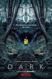
Title Design Thriller Dark
1) How many titles are displayed during the opening sequences to the film? Which ones?
In the opening sequence of the Dark on the website Art of the titles there is a total of 18 titles displayed. These titles included the producer, casting crew, makeup crew, and the director of photography. The titles contain the important people working behind the movie and that gets a credit for their hard work.
2. What connotations do the images carry? (how do you they make you feel)
The images in the opening scene of dark are filmed with a mirror effect. This is obvious due to the replicating image of the actor or item on the oppisite side of the screen. However, the degree of mirror is confusing but almost reminds me of a POV shot. The titles on the screen are simple white with yellow undertone that makes them pop from the dark background and every new shot is a new title. Stated on arts of the title," “The brief was to get a feminine font with a hard edge. After The thriller aptly opens with a stunning sequence that takes our world and dismembers it, assembling the pieces into something eerie but beautiful. There’s a discomfort in the imagery, an awkward folding of bodies and forms. Doorways bend into themselves. Eyes blink impossibly inwards. With design by Lutz Lemke and music from Apparat featuring Soap & Skin, the title sequence is a disquieting scrapbook of moments and deeds. The work of title designer Danny Yount immediately comes to mind, particularly the opening to 2001’s Six Feet Under, as well as Yount’s symmetrical titles for Semi-Permanent Portland 2013. "
3. How is genre reinforced through symbolic and technical codes from the outset? (Can you tell what genre the film is) Yes, I could easily tell that this was in the genre of thriller because of the dark gloomy setting. Another hint was the creators choice of not adding a ton of gore but to make it more about supernatural. For example,"Co-creators Baran bo Odar and Jantje Friese present an intricate mystery filled with curious characters, fractured memories, horrifying legacies, and more than a dash of the supernatural."
4. What conventions are used to ensure the film appeals to its target audience?
- The mystery aptly opens with a beautiful series that takes our international and dismembers it, assembling the portions into some thing eerie however beautiful. There`s a soreness withinside the imagery, an ungainly folding of our bodies and forms. Doorways bend into themselves. Eyes blink impossibly inwards. With layout with the aid of using Lutz Lemke and song from Apparat providing Soap & Skin, the identify series is a disquieting scrapbook of moments and deeds. Stated in the art of the title," present an intricate mystery filled with curious characters, fractured memories, horrifying legacies, and more than a dash of the supernatural."

Comments
Post a Comment